software residency

Role
UX Designer, UI Designer

Client
ZEAL, LEARN Academy

Focus Area
User Research, Information Architecture, Prototyping, Usability Testing, Visual Design (from established components)

Arrow pointing right
Challenge
UX

Closing the Skill Gap: Developing the Software Residency App

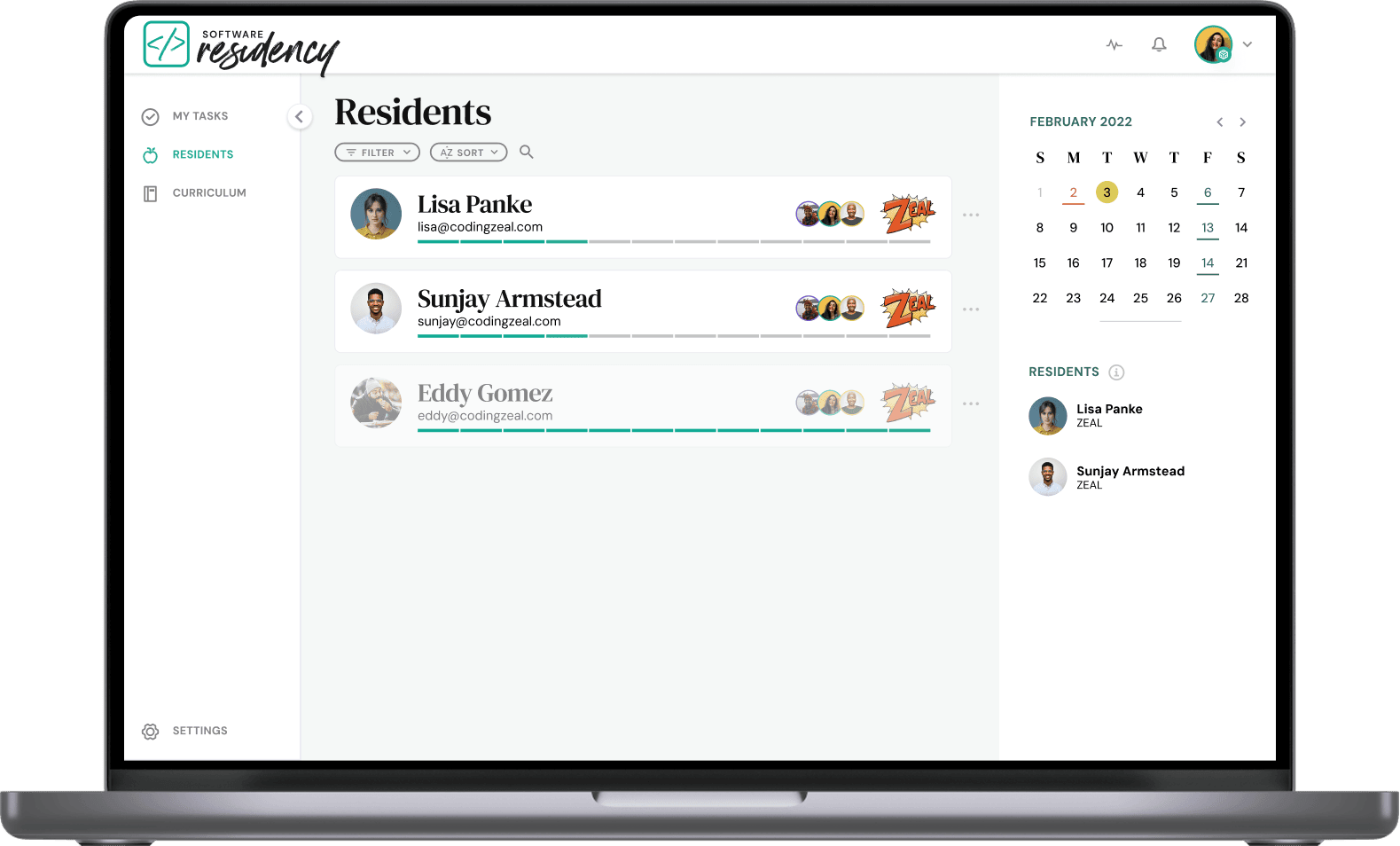
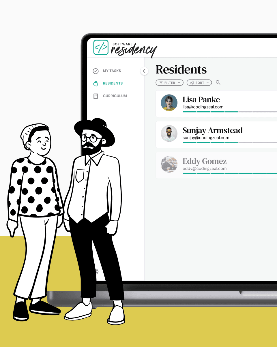
The Software Residency, created by ZEAL and LEARN Academy, aimed to close the skill gap between junior and senior engineers through mentorship. The challenge was to develop an app enabling mentors to easily track and support their mentees' growth.

Arrow pointing right
Impact
UX

A Unified Platform for Collaborative Feedback

2

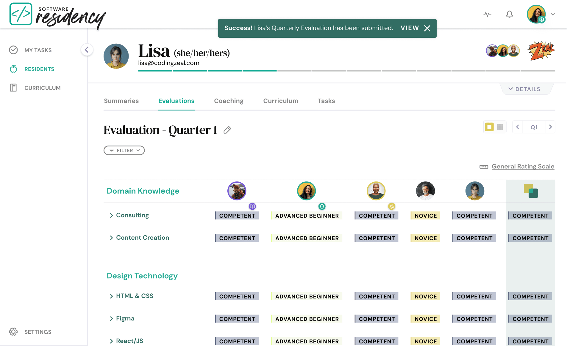
Efficient Tracking: Simplified weekly updates and quarterly evaluations to track mentees progress.

3

Collaborative Feedback: Enabled mentors to collaborate on mentee development.

1

Unified Platform: An app providing mentors with an overview of all their mentees and their progress.

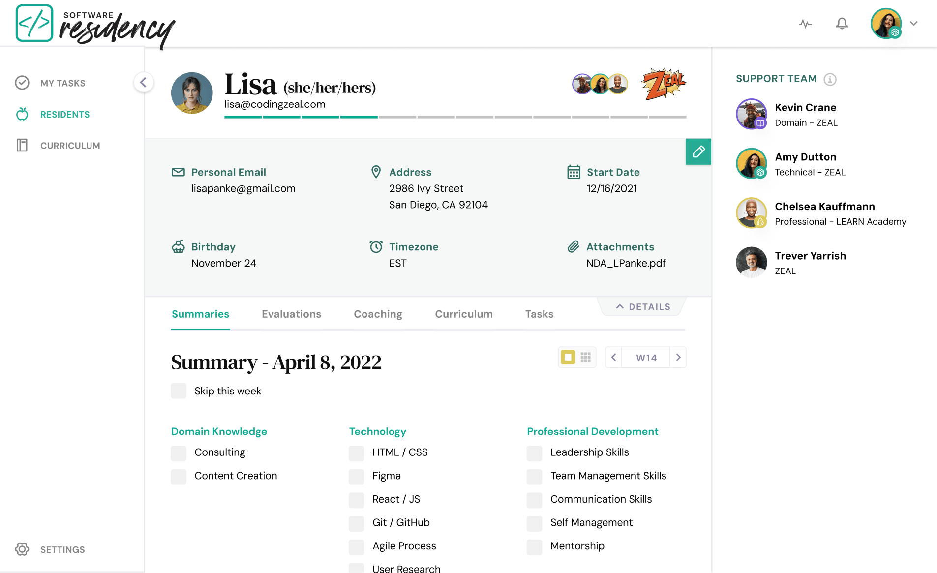
Mentor Flow in Software Residency App - Step 4
Mentor Flow in Software Residency App - Step 2
Mentor Flow in Software Residency App - Step 3
Mentor Flow in Software Residency App - Step 5
Mentor Flow in Software Residency App - Step 6
Arrow pointing right
Approach
UX

A 3-Step Process to Understand my Users

2

UI Flow Mapping & Prototyping

3

Design Iterations & Usability Testing

1

Understanding User Needs

Arrow pointing right
Understanding user needs
UX

Gathering Insights: Surveys and Interviews with Mentors and Mentees

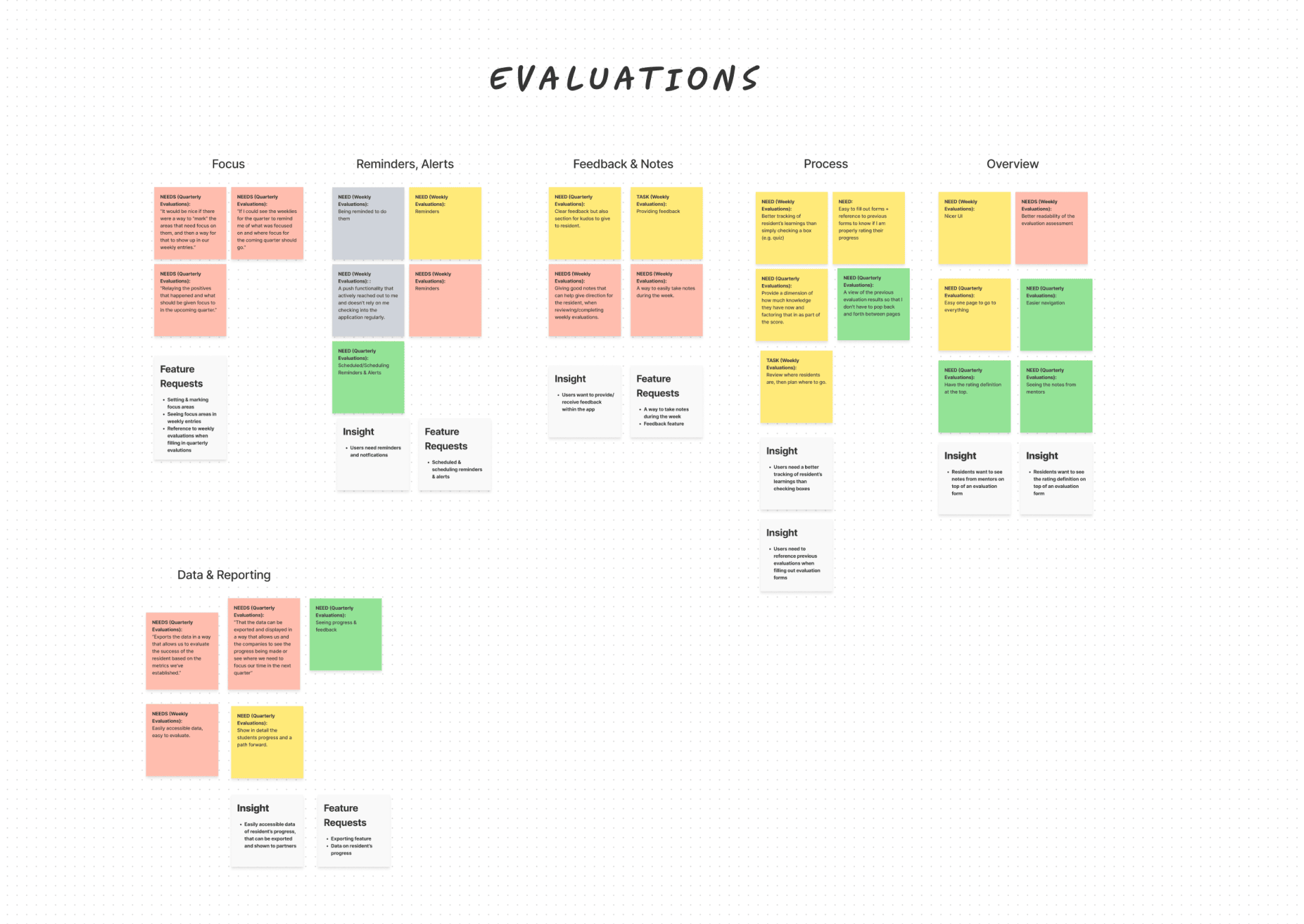
We conducted surveys and interviews with mentors, mentees, and administrative roles to gather goals and needs for the app. The data was synthesized into an Affinity Map, identifying key insights to shape the app's features and initial user stories.

1st

Insight
Mentors need a platform to track a resident’s progress.

2nd

Insight
Mentors want to add weekly updates and quarterly evaluations for each resident.

3rd

Insight
Mentors want to collaborate with other mentors by viewing their evaluations of residents.

Arrow pointing right
UI Flow Mapping & Prototyping
UX

Creating User Flows: Designing for Mentor Efficiency

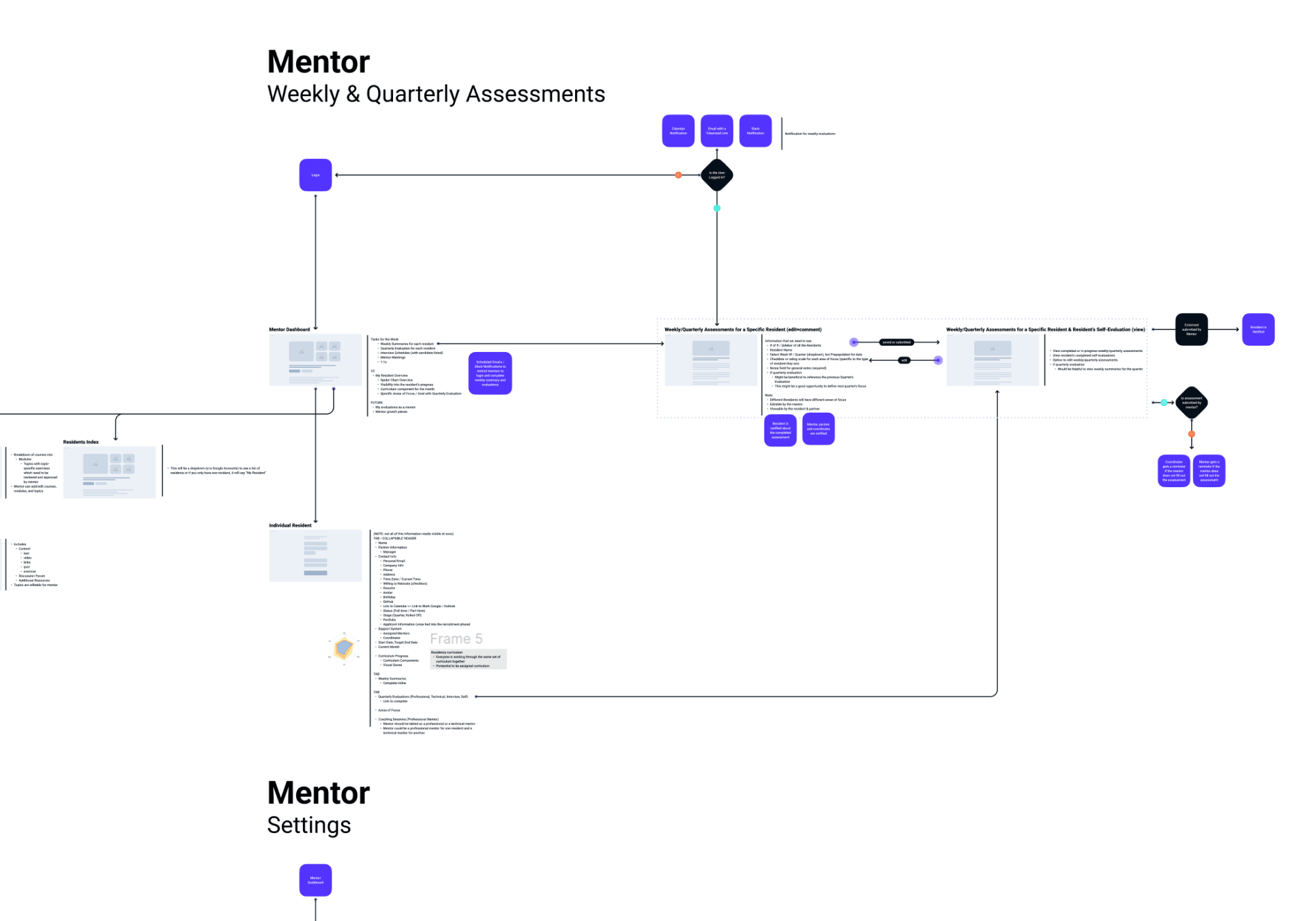
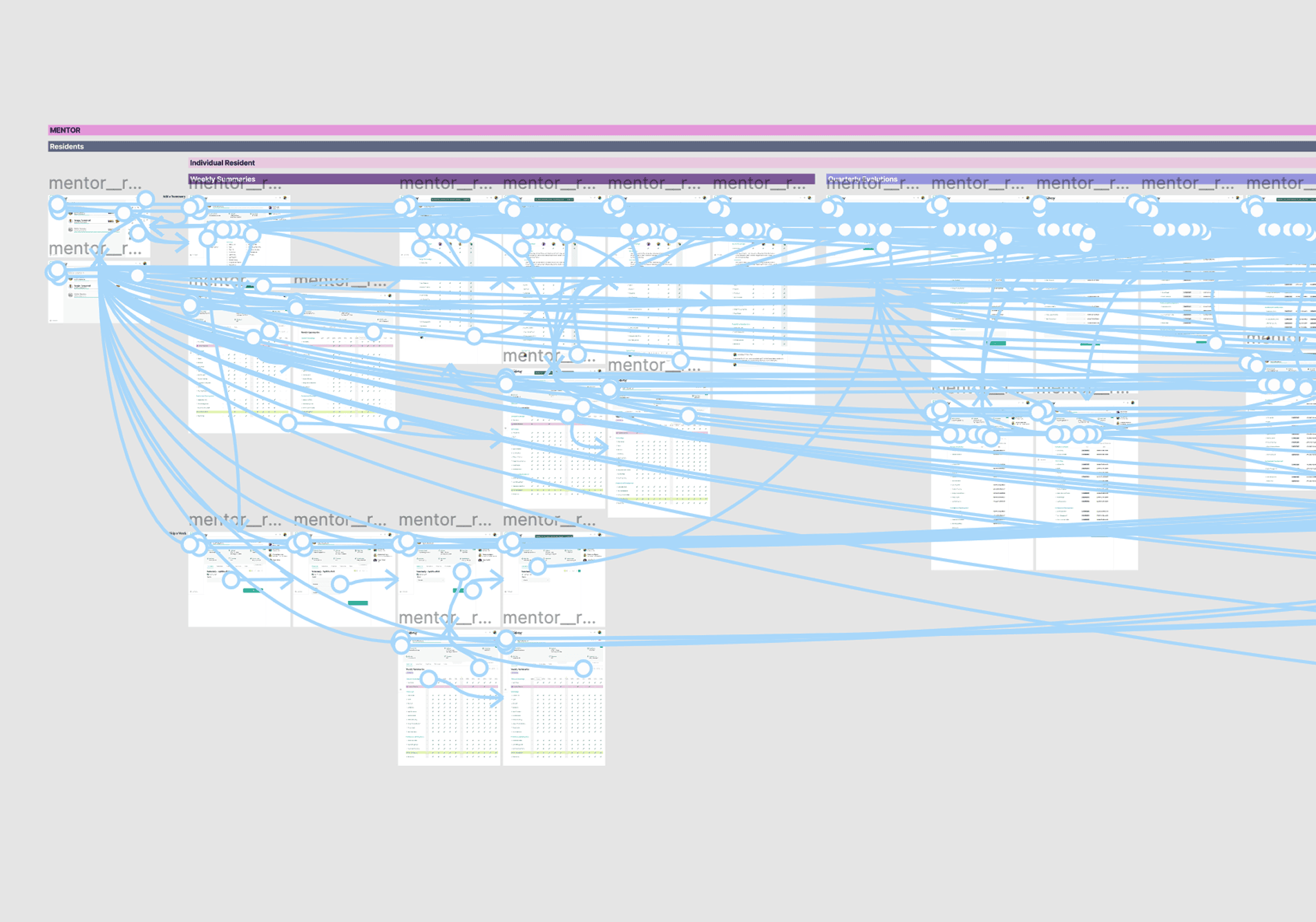
We focused on mentors as the primary user group, creating UI flow diagrams to understand all screens before developing wireframes and prototypes.

This included outlining the happy path and identifying navigation challenges.

UI Flow of Mentor Flow in Residency App

UI Flow for Mentors: Weekly & Quarterly Assessments

Arrow pointing right
Design Iterations & Usability Testing
UX

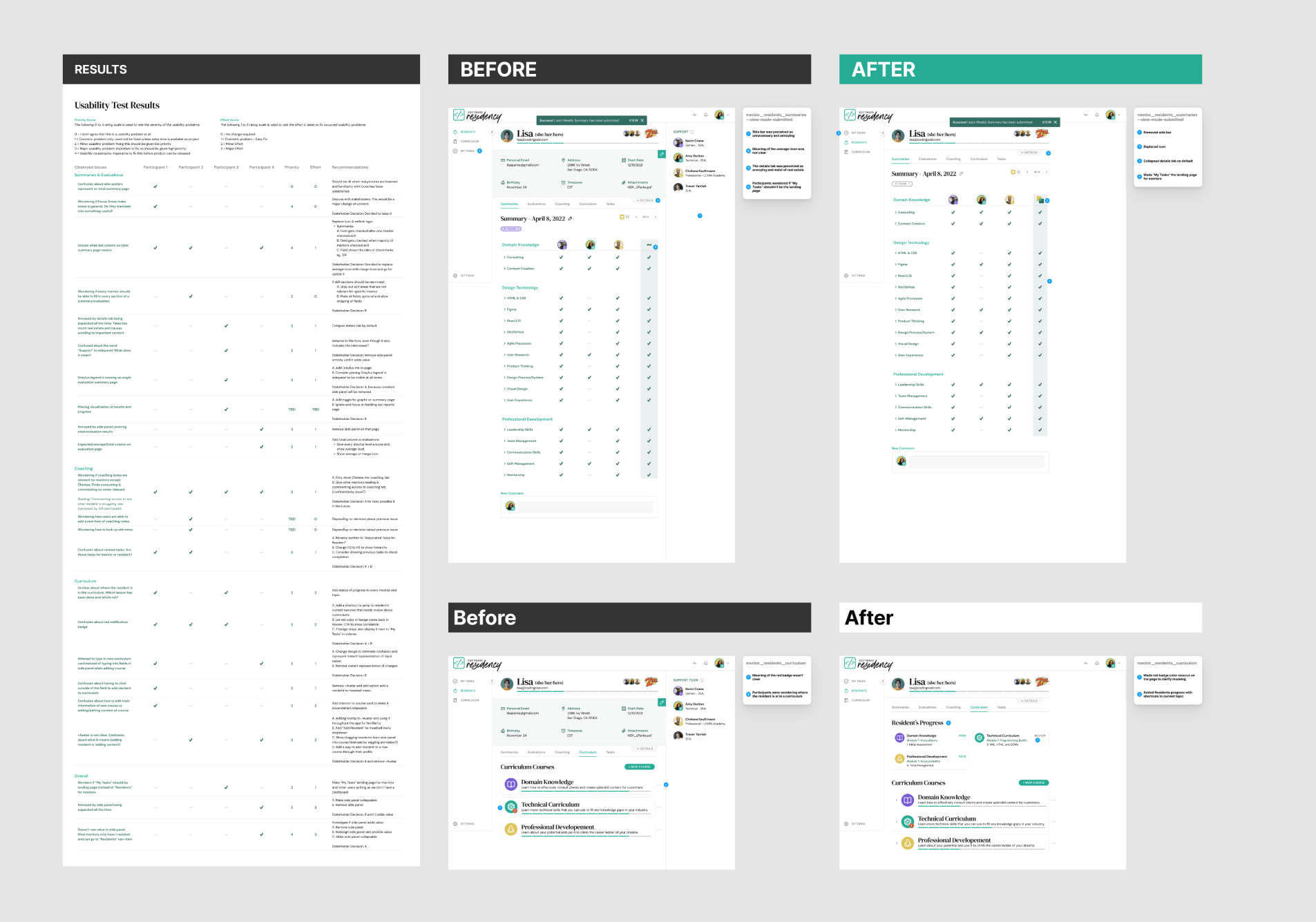
Iterative Design: Enhancing Usability through Testing and Feedback

The design process involved iterative wireframes and high-fidelity prototypes refined through stakeholder feedback.

Usability tests with mentors, using a severity scale, directly informed further iterations, significantly enhancing usability and user satisfaction.

Arrow pointing right
Outcome
UX

Delivering Results: Unified Platform and Efficient Tracking

One App, One Overview

Provides mentors with an overview of all their mentees, their progress, and areas for improvement.

Efficient Weekly Tracking

Mentors can track weekly focus areas for each resident, ensuring consistent support and guidance.

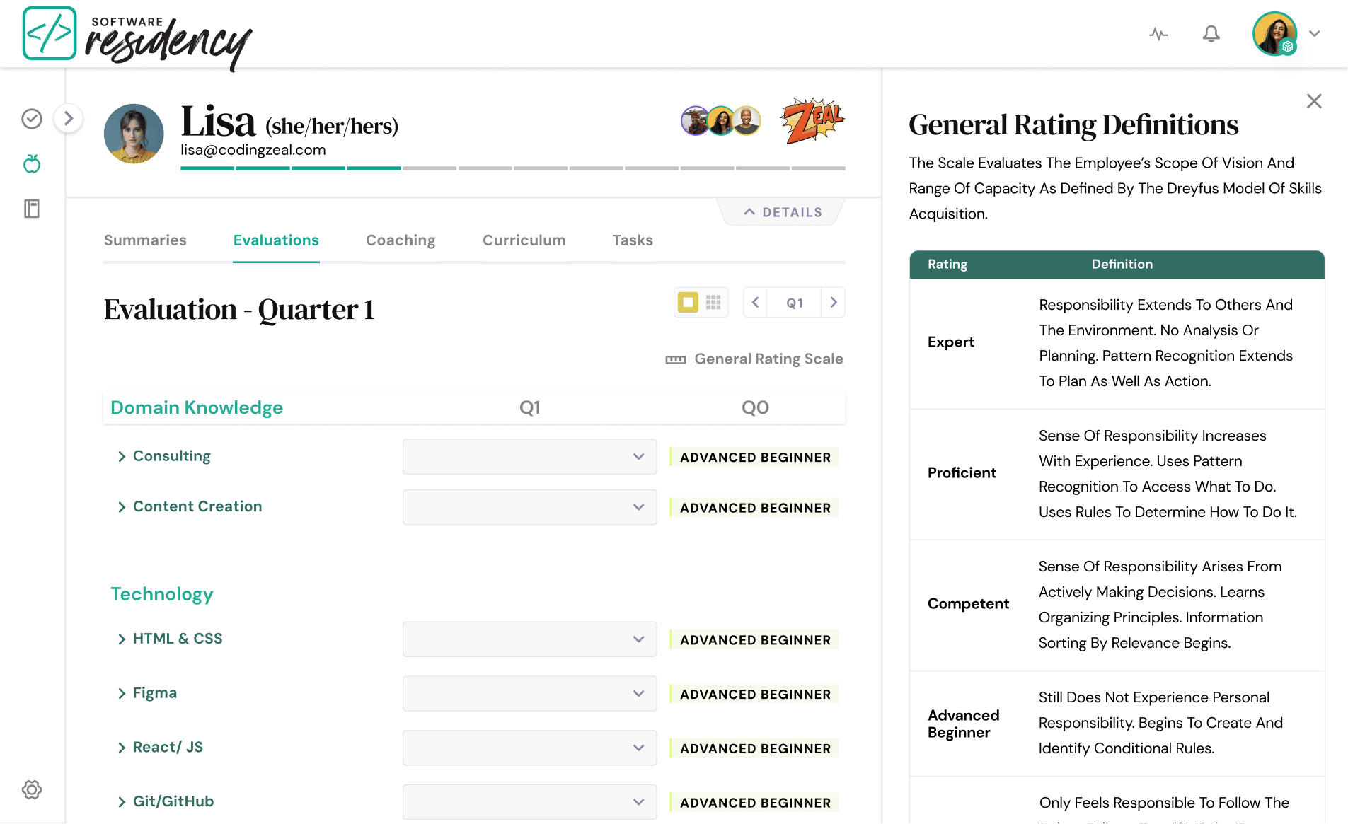
Detailed Quarterly Evaluations

Enables mentors to provide thorough evaluations using the Dreyfus model, identifying areas for targeted mentorship.

Collaborative Feedback

Mentors can add notes, view other mentors' evaluations, and compare evaluations, fostering collaborative feedback.

Arrow pointing right
Learnings
UX

User-Centered Design and Iterative Development

2

Understanding and empathizing with mentors and stakeholders is key.

3

User-centered design and continues iterations create impactful solutions.

1

How to utilize established design components and iterate on them.

Purple arrow pointing up